Creating ad landing pages that convert is both an art and a science. For paid media managers, it’s the final step that determines whether all the effort and budget behind your ad campaign pays off.
A well-designed landing page can mean the difference between a click that turns into a loyal customer and one that bounces away in seconds.
In this guide, we’ll dive deep into the strategies and elements that make landing pages successful.
From crafting compelling headlines to aligning ad copy with page content, you’ll learn how to optimize every aspect of your landing page to drive conversions.
Whether you’re working with Google Ads, Facebook campaigns, or any other paid media platform, these techniques will help you maximise ROI and achieve better results from your traffic.
The Purpose of a Landing Page 📈
A landing page is not just another page on your website, it’s a conversion machine, designed to turn ad clicks into meaningful actions.
Unlike standard web pages, which often serve multiple purposes or audiences, landing pages have one singular goal: to guide visitors toward a specific action, whether that’s filling out a form, making a purchase, or signing up for a service.
Why Landing Pages Matter
Paid ad traffic is precious. Every click represents an investment of your time and budget.
Sending that traffic to a generic homepage or unfocused page dilutes its potential, often leading to higher bounce rates and fewer conversions.
Landing pages solve this by tailoring the experience to match the intent behind the ad, delivering exactly what the visitor is looking for.
The Role of Landing Pages in the Buyer Journey
Landing pages act as the bridge between interest and action. They’re crafted to meet the specific needs of your target audience at a particular stage of the funnel:
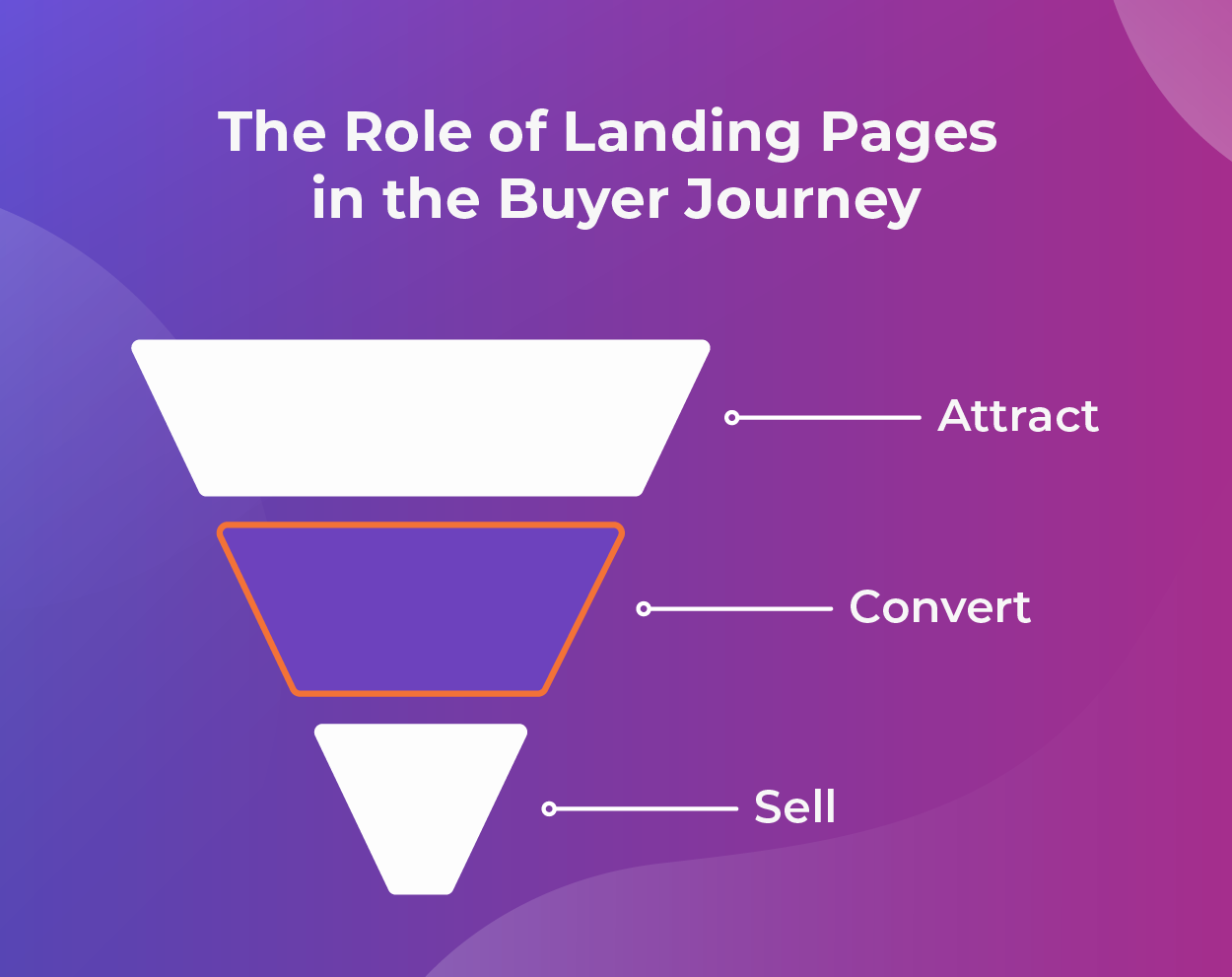
- Attract – Top-of-Funnel: Provide value with downloadable resources or free trials to capture leads.
- Convert – Middle-of-Funnel: Highlight product features, benefits, or testimonials to build trust.
- Sell – Bottom-of-Funnel: Drive urgency with time-sensitive offers or direct purchase options.
The ROI of Optimised Landing Pages
The impact of an optimised landing page is undeniable. Research shows that companies with 10 to 15 landing pages see 55% more conversions than those with fewer than 10.
Even small tweaks like refining a headline or improving page load speed can lead to significant gains.
By focusing on creating effective landing pages, you’re not just improving conversions – you’re also improving the efficiency of your entire ad spend.
Key Elements of a High-Converting Landing Page
Creating a landing page that converts requires more than an attractive design. Each element must work together to guide visitors seamlessly toward your desired action.
Compelling Headlines
Your headline is the first thing visitors see, and it sets the tone for their experience. A strong headline:
- Clearly conveys the page’s value proposition.
- Aligns with the ad copy to create consistency.
- Uses action-oriented or benefit-driven language.
Example: Instead of “Welcome to Our Site,” try “Increase Your Sales by 200% With Our Proven Marketing Tools.”
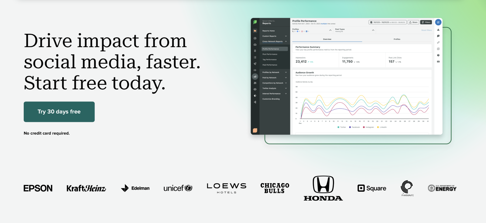
Below is a real-world example from Sprout Social. They have a clear compelling headline, “Drive impact from social media, faster.”
Engaging Visuals
Visuals play a critical role in capturing attention and supporting your message. Use:
- Hero images: High-quality images that showcase your product or service in action.
- Videos: Brief, engaging clips to explain complex ideas or demonstrate value.
- Icons: To break up text and highlight key benefits.
Persuasive Copy
Every word on your landing page should drive your visitors closer to conversion.
Effective copy:
- Speaks directly to the audience’s pain points and needs.
- Emphasises benefits over features.
- Keeps it concise! Visitors should understand the offer at a glance.
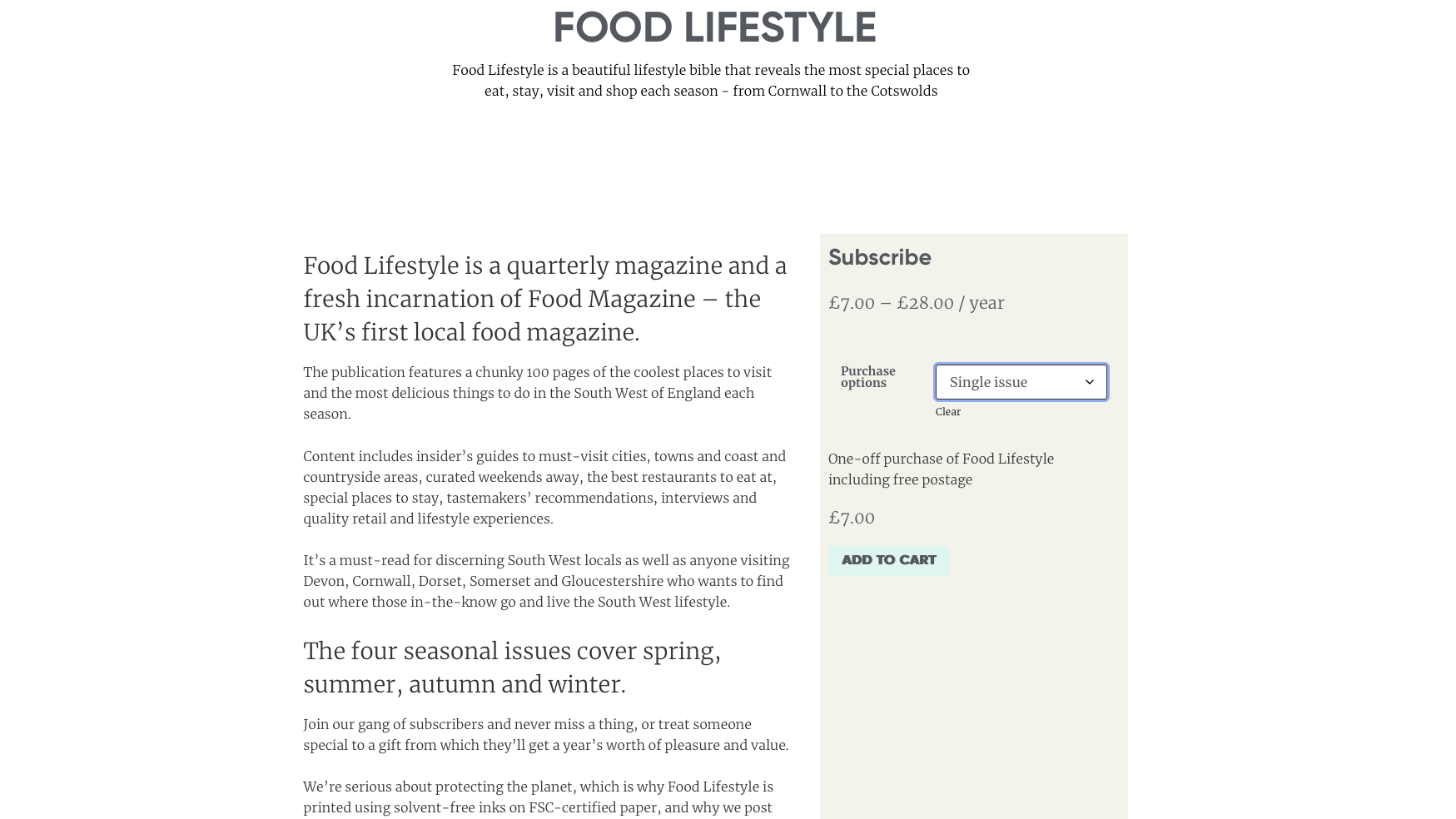
Below is an ineffective example from FOOD LIFESTYLE magazine. The page is intended to drive magazine subscription purchases but fails to be persuasive or concise.
The call-to-action is particularly weak, and the overwhelming amount of text makes it difficult to understand the benefits of subscribing.
Clear and Singular Call-to-Action (CTA)
The CTA is the heart of your landing page. Make it:
- Actionable: Use verbs like “Get,” “Claim,” or “Start.”
- Visible: Ensure it stands out with contrasting colors and strategic placement.
- Focused: Limit the page to one primary CTA to avoid distractions.
Example: ‘Download Your Free Guide Now’ is more effective than a generic ‘Submit.’
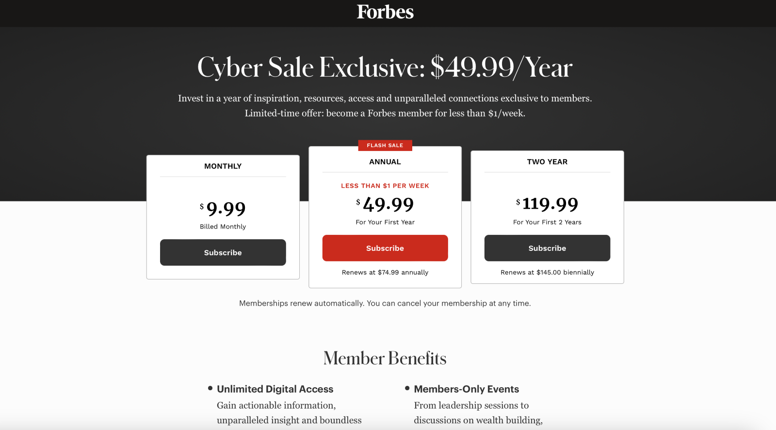
Here’s a real-world example from Forbes showcasing their Forbes Membership Subscription. Their call-to-action, ‘Cyber Sale Exclusive,’ is both compelling and urgency-driven.
They effectively use contrasting colors and strategic placement to highlight their best deal, and the page design is straightforward and uncluttered, minimising distractions for a clear user experience.
Trust Signals
Building trust is essential for conversions. Include:
- Testimonials: Real quotes from satisfied customers.
- Trust badges: Certifications, awards, or logos of well-known clients.
- Case studies: Highlight measurable results your service has delivered.
Example: Zendesk, an AI powered support software, demonstrates clear trust signals in their page by incorporating a quote from a real customer and stats to support their claim.

Designing for Ad Alignment
Consistency between your ad and landing page is critical to achieving high conversion rates.
When visitors click an ad, they arrive with specific expectations. If your landing page doesn’t meet those expectations, you risk losing them.
Match the Message
Your landing page should mirror the promise and tone of your ad. Consistency builds trust and reassures visitors that they’re in the right place. Ensure:
- Headline alignment: Use the same or a very similar headline to the one in your ad.
- Visual consistency: Incorporate similar imagery, colors, and branding elements.
- Tone matching: Maintain the same tone of voice, whether it’s professional, casual, or urgent.
Example: If your ad says ‘Get 50% Off on Premium Hosting,’ the landing page should prominently feature this offer in the headline and visuals.
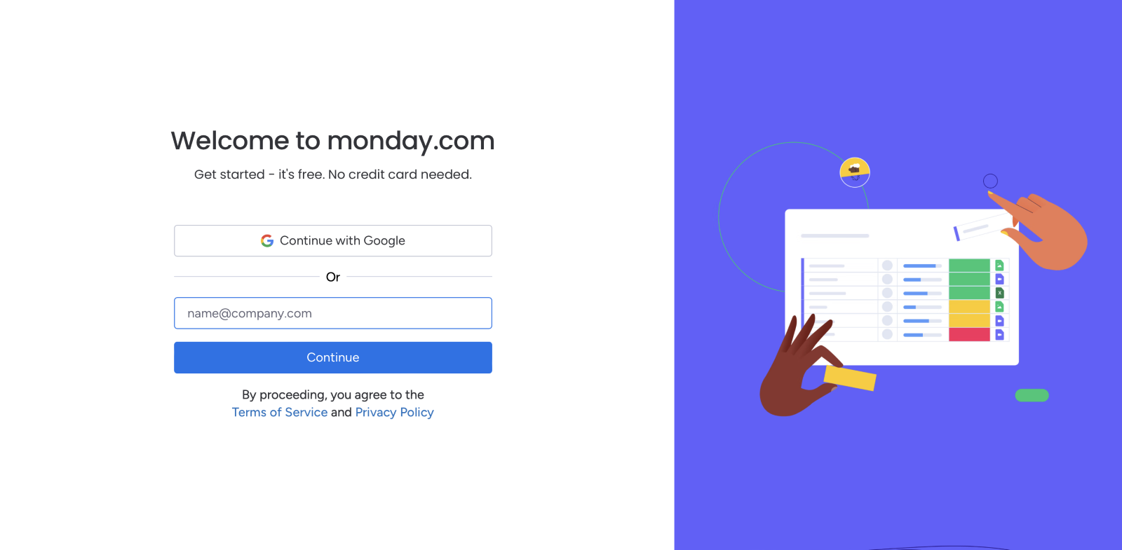
Monday.com is a great example of showing consistency in their copy and messaging.
Reinforcing the message on both pages, ‘Free’ and ‘No credit card needed.’

Create Audience-Specific Pages
Segment your audience and craft unique landing pages for each group. By tailoring content to match specific user intent, you’ll increase relevance and engagement. Consider:
- Ad platform targeting: Design separate pages for Google Ads, Facebook Ads, or LinkedIn campaigns, reflecting each platform’s audience.
- Demographics or industries: Customise content for different buyer personas, such as small businesses or enterprise clients.
- Stage of the funnel: Use distinct pages for awareness, consideration, and decision-making phases.
Reinforce Ad Keywords
Integrating your ad’s keywords into the landing page copy helps with relevance for both users and search engines. Google Ads, for example, rewards keyword alignment with higher Quality Scores, which can lower your cost per click. Focus on:
- Including primary keywords in the headline, subheadings, and CTA.
- Avoiding keyword stuffing, which feels unnatural and can alienate visitors.
Focus on One Conversion Goal
Your landing page should have a single, clear purpose that matches the ad’s intent. Avoid overwhelming users with multiple CTAs or unrelated content. For instance:
- If your ad promotes a free trial, the page should focus entirely on converting visitors to sign up for that trial.
- Ensure supporting content (like testimonials or feature lists) reinforces this single goal without diverting attention.
Example: Here’s an example from Apollo, showcasing a bold, clear, and compelling CTA.
By highlighting the ‘Get started’ button in yellow and avoiding distracting imagery around the primary action, they’ve created a streamlined user experience.
The clean layout and focused design keep attention locked on the end goal, ensuring no distractions divert users from taking the desired action.

Personalise Where Possible
Dynamic content and personalisation tools can help create landing pages that feel tailored to individual users. Consider:
- Location-based content: Display location-specific offers or testimonials.
- Behavior-based content: Personalise pages based on user history, like previous purchases or interests.
- Ad campaign tracking: Use UTM parameters to dynamically adjust landing page content based on the ad clicked.
Maintain a Clear Path to Action
Ad alignment is about more than just visuals and copy – it’s also about usability. Make it easy for visitors to follow through by:
- Placing the primary CTA in the most visible location (above the fold).
- Simplifying navigation by removing unnecessary links or distractions.
- Ensuring forms are short and easy to complete.
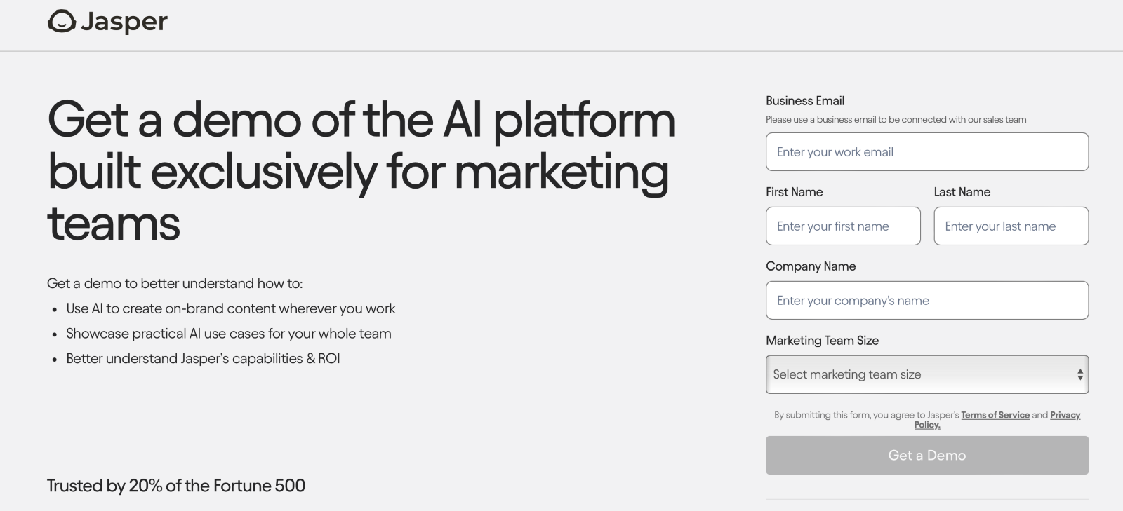
Example: Jasper show a clear path to action below, with a clear CTA, a short form and no unnecessary links that could distract the viewer.
Mistakes to Avoid ❌
Even the best-designed landing pages can fail if they make critical mistakes. Understanding what to avoid is just as important as knowing what to include.
Cluttered Design
A landing page overloaded with text, images, or multiple calls-to-action can overwhelm visitors and dilute your message.
🚫Avoid:
- Too many competing elements or distractions.
- Unnecessary navigation links that pull users away from the conversion goal.
💡Solution:
- Keep the design clean and focused, with plenty of whitespace to emphasize key elements.
- Use a single, prominent CTA.
Slow Loading Speed
A slow-loading page frustrates users and increases bounce rates. Even a delay of one second can significantly reduce conversions.
🚫Avoid:
- Using unoptimised images or videos that increase load times.
- Overloading the page with heavy scripts or plugins.
💡Solution:
- Compress images and enable lazy loading.
- Use a Content Delivery Network (CDN) to speed up content delivery.
- Test page speed with tools like Google PageSpeed Insights.
Misaligned Messaging
If the promise made in your ad doesn’t match the content of your landing page, visitors are more likely to leave.
🚫Avoid:
- Creating landing pages that don’t reflect the ad’s offer or tone.
- Using generic content that fails to address user intent.
💡Solution:
- Ensure your headline, visuals, and copy directly mirror the ad’s messaging.
- Tailor landing pages to match different ad campaigns or audience segments.
Weak or Missing Trust Signals
A lack of credibility can prevent visitors from converting, especially when they’re unfamiliar with your brand.
🚫Avoid:
- Failing to include testimonials, case studies, or trust badges.
- Neglecting to highlight your security features.
💡Solution:
- Display reviews, client logos, and certifications prominently.
- Use trust indicators like SSL badges or payment security icons.
Poor Mobile Optimisation
With a large percentage of users accessing pages on mobile devices, a landing page that isn’t mobile-friendly can lose conversions.
🚫Avoid:
- Designing for desktop only, leading to clunky or hard-to-navigate mobile experiences.
- Ignoring mobile-specific usability, such as tap-friendly buttons.
💡Solution:
- Use responsive design to ensure your landing page works seamlessly on all devices.
- Test your page on multiple screen sizes to ensure it’s intuitive and easy to use.
Lack of Testing and Iteration
Failing to test your landing pages means missing opportunities to improve performance.
🚫Avoid:
- Assuming your first version is perfect.
- Ignoring analytics and user behavior data.
💡Solution:
- Continuously A/B test key elements like headlines, CTAs, and visuals.
- Use insights from analytics tools to guide updates and refinements.
Overcomplicated Forms
Long, complex forms can deter users from completing them, especially if the requested information feels unnecessary.
🚫Avoid:
- Asking for too much information upfront.
- Using forms that are difficult to fill out on mobile devices.
💡Solution:
- Limit forms to essential fields (e.g., name and email for a free resource).
- Use smart fields that auto-fill or reduce friction for returning users.
Final thoughts
Creating ad landing pages that convert is a strategic process requiring a balance of compelling design, user-focused content, and continuous optimisation
For paid media managers, these pages go a long way to determine the success of your campaigns and, ultimately, your ROI.



Add comment