This is part two of our guide to becoming a reseller of web hosting, this one concentrating more on marketing. Specifically, on practical tips to begin creating your hosting brand. It’s aimed at those starting a new company, but may also be useful for those who are already in business.
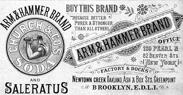
Companies have understood the value of a having a brand identity since the Victorian era.
A brand will make your web hosting company memorable, and people are more likely to buy – or pay more for – products and services they have already been exposed-to. This human foible gave rise to advertising as we know it: where companies advertise their brand – not just the benefits of their product or service.

A brand can become associated with positive emotions irrespective of the quality and value of what they sell. It’s an intangible asset that’s sometimes worth more than ‘real’ tangible assets like premises or inventory.
A brand can become aspirational, like Apple or Ferrari. Or become so associated with a product that it becomes part of the language like ‘Googling’ or ‘Hoovering’.
But if you’re starting a business reselling web hosting, this isn’t going to happen. We’ve grudgingly accepted that people won’t be ‘20i-ing’ their website in the near future. But you can dream.
Nevertheless, having a recognisable brand does add value to your company.
Thinking about branding saves time
Building a brand isn’t ‘marketing fluff’. When starting your hosting company, it’s wise to have a brand strategy in mind.
It will save you time and effort in the long-run, because it helps focus your decisions, enabling efficient choices across the business.
And if you do your job well, it will also mean people remember your brand, become loyal, and help make your business a success.
Read our tips on the 5 main elements to create a successful brand from scratch.
1. Your brand name
Names are powerful.
I’ve already gone in to the naming of companies in some detail already in this blog, so I won’t repeat that.
Rather, to summarise: you need to pick something unique, that will appeal to your market. It needs to be simple, easily-pronounceable in your target language (we’re looking at you, Tsohost) and memorable. It should be something that you’re comfortable-with personally, because (hopefully) you’ll be using it for a long time.
Having what you do in your name can help too, so *Something* Web Hosting could always be a good start!
Don’t overthink it, though.
Most of the big brands’ names have nothing to do with what they’re actually selling. Out of the world’s top ten most valuable brands in 2022*, only 2-3 of their names* have anything remotely to do with what they sell:
- Apple
- Microsoft
- Amazon
- Amazon
- Samsung
- Toyota
- Coca-Cola
- Mercedes-Benz
- Disney
So naming your business after yourself (or a fruit/ your cat, etc.) will probably do little harm.
(* Source Statista)
2. Your brand colours
Your brand colours are important. Or at least: many people tell us so, and lots of brands perpetuate that idea.
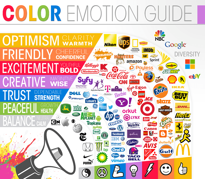
Broadly speaking, certain colours can be linked to feelings or concepts. So if your want to brand to convey ‘trust’, you might consider using navy blue.

In the end, it depends on your overall marketing strategy. For example, if your target market is female you might go for the colour pink in your logo and branding. Equally, you might want to avoid such awful stereotyping like the plague! It’s up to you.
While the colours you choose might depend on your target market and your own taste, how you use them is less debatable.
Visuals tend to be more striking and memorable if you limit the number of colours you use, with one to three being the sweet spot (plus black and white). It can help bring consistency across your services.
It’s also important to design your brand colours with accessibility in mind: contrasting colours work better for easy readability. Colour ‘blindness’ in its various forms needs be taken in to account too: there are plenty of tools to help you with this, such as Toptal’s.

In a later article in this series – about designing a website for a hosting business – we’ll go further in to accessibility.
Colour theory tells us that certain colour combinations contrast, match or simply work well together to the standard human eye. If you haven’t been to the Chromatic University there are numerous tools that can help you pick a colour scheme, such as Coolors. From a single colour (or more), it will suggest colours that work will well with it.
Above all, you need to be consistent with your colours. While most of your business will be on in the web, when designing a brand you need to plan for the future. So think about business cards, letterheads, compliment slips, fluffy desktop gonks…
You may not need them now, but consider how your brand colours could be used in the future. Will they look good on the side of your private jet?
Finally, you’re always free to ignore everything!
You could rebel: be as garish and tasteless as possible. Lings Cars appear to be doing well.
Or unleash the unstoppable force of brutalism, which confines itself to simple contrasting colours – and often eschews colour entirely! In the end, and as always, it depends on what kind of market you’re aiming at.
3. Your brand sounds
Don’t you love it when a web page plays music or a video auto-starts, helpfully eliminating the need for an extra click..?
No, I’m not talking about those kind of sounds, exactly.

But thinking about what your brand could ‘sound’ like is a great exercise to help fully flesh-out your brand strategy. You could also expand the exercise across the senses to how your brand feels, tastes or even smells…
But I’m not going down that route today! Continuing with sounds: if you were to have sounds to give feedback on button presses in your control panel or app, what would those be like? Would they be efficient clicks, futuristic bleeps, cheeky chirps or naughty honks?!
If you were to make video content, what would be your theme tune? What would the background music be like if you were explaining your services?
What would the video presenter sound like..? Which neatly brings us on to:
4. Your brand voice and tone
Brand voice might include the accent and dialect of a presenter, but ‘voice and tone’ goes much beyond that.
Your voice could be described as your ‘brand personality’ and should cover all your communications, wherever they happen. For example, you might decide to go for an ‘energetic’ voice, and avoid passive phrases. Or your voice might be ‘formal’ and never use contractions (‘it is’, never ‘it’s’). Your brand voice might be be technical and expert, or friendly and simple.
Your voice also shows where it comes from. Is it elitist or down-to-earth? Does it use a local dialect or Standard English? Does it use American or British English spellings (or your own regional variations)?
Tone is your brand voice wearing different uniforms. Just as in real life, your tone will change depending on where you are and who you’re speaking-to.
It’s about context. For example, 20i might adopt a lighter, more playful tone on social media and this blog than we do in replies to technical support queries…as we hope you appreciate.
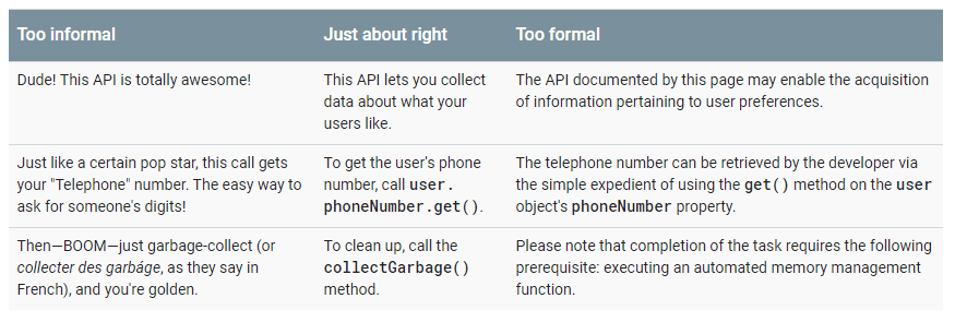
One of the best ways to think about tone (and voice) is to describe what it isn’t. I like how Google describes its Developer Documentation tone:

= “like this, not like this” approach.
Mailchimp’s is also good:
- Fun but not silly
- Confident but not cocky
- Smart but not stodgy
- Informal but not sloppy
- Helpful but not overbearing
- Expert but not bossy
- Weird but not inappropriate
Above all, your voice should be authentic. It should reflect you and your company’s culture.
Don’t try to fake it: people will spot it, even if it isn’t something they’re consciously aware of. It will just seem ‘off’ to them, and it only takes the slightest bit of anxiety to make a potential client look elsewhere.
So if you’re from Mansfield and go to work in a collar and tie every day, don’t try to write like you’ve just walked off a California beach. Keep it real, dude.
5. Create a style guide. Right away.

“Oh no… not more work…”
I know: you have it all in your head, so why do you need to write it all down?
The reason is: you’ll regret it later if you don’t do it now.
Your brand style guide can be a lifesaver once you become successful and busy. Documenting a style guide when you start your web hosting business reduces the amount of work you have to do later.
It’s particularly useful if you have new employees: they’ll understand how to communicate with the company voice, whether that’s over the phone, through email, social media or web copy. You won’t have to explain your company ethos or identity.
If you employ contractors you can send them your style guide, and it’s a great place to keep your technical information: such as font names and hex colour codes (it can also become part of a digital design system – more on that in a later article).
Your first style guide might just be a one-pager. It doesn’t have to be highly-detailed, and it shouldn’t be written in stone. It should just be an evolving document that will adapt to changes as your company grows.
If you start your style guide when your business is small, it reduces the amount of work you have to do later. If you’ve already tried to make a style guide for an long-established company you’ll understand how this could solve you a lot of hassle and arguments!
It affords you clarity and consistency from the get-go. And that’s all you need to create a brand for your reseller hosting company.
To grow that brand, you’ll need a bit of repetition through marketing and/or PR. We’ll be covering ways of doing this in later articles, but let us know your thoughts.


[…] Part two of our guide to making a success out of a hosting business is here: Building a brand. […]